Beautiful Science: Picturing Data, Inspiring Insight. British Library, London
Turning numbers into pictures is an increasingly important (and necessary) part of our contemporary existence. Big Data. We have tons of it and collect more every minute of every day. At school age we are given rather dry maps, charts and diagrams to help us to interpret data but today technology has changed and what we expect it to do has changed. Now we watch the weather forecast by way of speeded up clouds and moving rainy puddles, a far cry from Fred’s Weather Map which saw the TV host jump about a floating map to stick on a plastic sunshine (although this could be described as a type of performative data visualisation). Online, you can expect super smart, often interactive, data visualisations for anything from world populations to how popular Gangnam Style was compared to The Harlem Shake.
The free exhibition Beautiful Science, open on the mezzanine level of The British Library, examines both the modern day souped-up data visualisations and infographic in context with its much older, but no less relevant, printed paper ancestors. The exhibition is split into three sections, weather/climate, population/health and natural history.
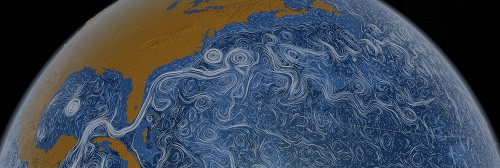
Weather and climate seem to be a good place to start, as this is possibly the kind of visualisation we see most on a daily basis. The exhibition opens with NASA animation ‘Perpetual Ocean’ which charts the flow of ocean surface currents from 2005-7. The lines of water move across the surface of the screen in Van Gogh-like painterly swirls. The data presented allows scientists to better understand how ocean currents circulate over time, but it is doubtful that this was the main attraction for most visitors. During my visit, a varied audience of all ages stood mesmerised watching the shifting currents on screen.
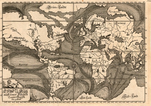
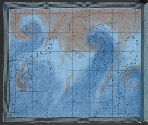
Returning to the origins of this kind of data collection, several ship log-books are on display. From its beginnings in 1600, the East India Company ships kept journals. Captain of the HMS Beagle (in which Charles Darwin sailed as a naturalist), Robert Fitzroy’s ‘The Weather Book’ contains his theories of the evolution of wind patterns. The water colour hues of blue and brown cover the line maps within, both beautiful and remarkable they look like modern satellite images. A map from 1685 illustrates ocean currents as understood at the time. Created by British Astronomer, Edmond Halley, the map charts ocean trade winds and the thin hair lines appear woven into the paper giving the map a sense of gusty movement.
Away from just weather data, a log-book from 1709 shows the breadth of data that was recorded by crew. The Rochester, sailing from England to China via Batavia (now Jakarta), created written logs of weather, temperature and ship-life. The written information is punctuated with drawings of the animals they encountered along the way. On the page shown within this exhibition a bird, rendered delicately in black ink swims across the surface of the page popping out as a sign-post for the relationship between data and lived observation and experience. It is interesting to read that all of these log books and the data that is contained within them, are not artefacts of dead data. They are documents that are still referred to today by organisations such as the MET Office.
Darwin crops up again, of course, in the natural history section of the exhibition. ‘On the Origins of the Species’ is open to the only diagram that appears in the whole book. Rather spartan in its design of the taxonomic diversification of life, it has a minimalist beauty. This diagram and its tree-like structure is an opportunity to see the early roots of the physical shapes we use commonly use in the design of our infographics – the egg and the tree. As humans, we are endlessly fascinated by putting things in order, a way to define our place within the systems of life and conscious thought so it is no surprise that with both shapes man is at either the top (of the tree) or at the centre (of the egg).
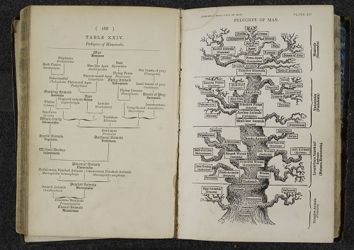
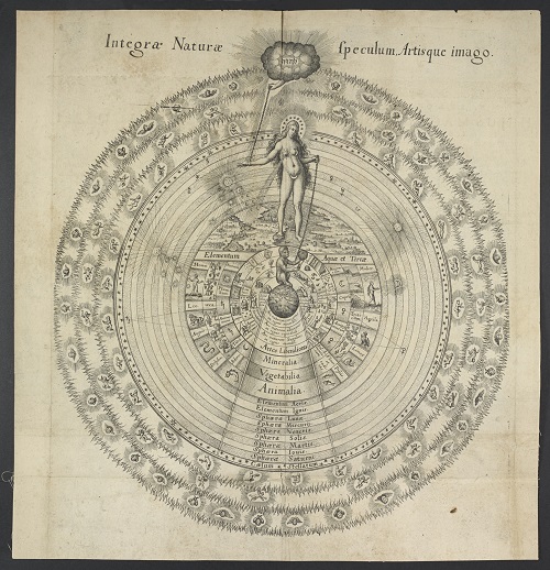
Ernst Haeckel, inspired by the evolutionary ideas of Darwin created ‘The Pedigree of Man’ (1874) a tree which organises all life on earth in a more illustrative fashion. The twisted boughs of the tree’s branches are labelled from the bottom up with primitive worms, amphibians to man. Man is labelled at the top, crowning the ancient tree like a star on a Christmas tree. ‘The Great Chain of Being’ illustrates an ancient Greek concept that classifies life on earth in hierarchical order but circular shape. Each animal is given a band or rung and presiding over the natural world is Sophia, the goddess of wisdom, with little crescent moons protecting her modesty.
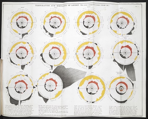
“Population and Heath” is, perhaps, the most fascinating section of the exhibition as we see very clearly how data visualisations can be a device of social change and potentially keep us alive. Charting the correlation between temperature and cholera deaths (between 1840-50) is ‘Temperature and mortality of London’ made by epidemiologist and statistician William Farr. This plots cycles of temperature compared with cholera deaths between 1840-50. The circular diagrams are designed to look like eyes, they stare out from the page in reds and blacks, sometimes flaring up like fireballs. An interesting modern map (2013) charts, in tones of blue, the number of fast food outlets per 100, 000 people in each local authority. Cities like London, Bristol, Manchester are obviously dark blue, saturated literally in saturated fat but there are slightly more intriguing pockets of fast-foodiness for example the seaside resorts of Torquay, Southend-on-Sea or the area around Hull.
From 1603, London parish clerks began to collect health related population data to monitor plague deaths. They published the weekly ‘London Bill of Mortality’ and on display in the exhibition is the amalgamation of 50 years of this data from demographer John Gaunt (1620 – 1674). The causes of death are fascinating. Amongst the data we see that in 1647 there were 147 deaths caused by worms, a significant number of deaths from ‘Wolf’ (?) and, in 1660, a record number of deaths from ‘Kings Wolf’ a type of Scrofula (swelling of the lymph nodes due to tuberculosis) which was believed, in the Middle Ages, to be cured by the touch of a monarch).
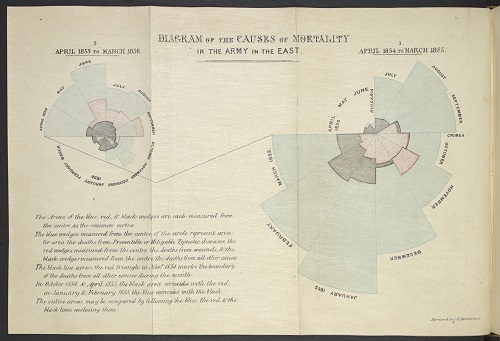
The star of this section is, however, Florence Nightingale’s seminal ‘Rose’ diagram entitled ‘Diagram of the Causes of Mortality in the Army in the East’ which shows in a kind of circular histogram the causes of death in soldier patients in the Crimean War. The intention was to show how far more soldiers died of preventable diseases than of wounds obtained on the battlefield. Nightingale understood the power of visualisation as a tool for change and sanitary reform. She would go on to become the first female to be elected to the Statistical Society of London in 1858.
There is much contemporary technologically clever data visualisations on show and the visitor is encouraged to interact. ‘One Zoom Tree’ encourages you to use the touch screen to explore the evolutionary relationships between tens of thousands of animals. As you zoom further in more detail is exposed. Elsewhere ‘Epidemic Planet’ is based upon the Global Epidemic and Mobility model which researchers used to accurately forecast the 2009 pandemic influenza outbreak. The interactive model allows the visitor to use the touch screen to visualise different epidemic scenarios and forecast outcomes and reaction measures. The interactivity, however, does not overshadow the older documents. If anything the failings of the technology, the sometimes clunkiness of the touch screens, highlights how the earlier graphs and maps hold a more enduring power. The data is only as good as the paper it’s printed or plotted on.
Game-changing, culturally useful and graphically beautiful Beautiful Science opens an all too brief window into the world of data visualisations, their history and future. This small display could well be and, I would argue, should be, seed a much larger exhibition worthy of the main British Library display spaces.